What Makes a Logo “Good”?

Mapusha Weaving is a cooperative of women weavers based in the village of Acornhoek in the Limpopo province of South Africa
So how do you know if the logo you are paying for is “good”?
There are plenty of bad logo designs out there. For a laugh or two, you can see some examples of bad logos here, for instance. The question is, what makes a logo design bad? What makes a logo good? How can you make sure that your new logo does what a logo is supposed to do?
I think every professional graphic designer has their own guidelines and standards as to what constitutes a good logo design. Here are my own guidelines:
1. Simple: A common denominator of many bad logos is that they are too complicated. Too many elements competing for attention, too many colors, too many drop shadows and metallic effects, too much going on. The best logos are simple, bold, easily recognizable. Think of the Nike swoosh, the McDonalds arches, the Apple…apple. Your logo is a statement about your company. You don’t want to look confused or complicated; you want to look bold and straightforward. A simple, bold logo makes your company look big. A complicated logo makes it look small and amateur. There should be a single, bold center of interest. The viewer should not have to look at many different parts to get the communication.
Simplicity doesn’t mean your logo has to look modernist or minimalist, however. A logo can look sophisticated, ornate, old-fashioned or retro, depending on the personality of your company. But regardless of style, the logo must be a simple and easily recognized symbol of your company.
2. Distinctive and memorable: Your logo needs to stand out from the pack. That’s why one of the first things I do when starting a logo design is search online and find logos of other companies in the same business. I go through hundreds of them. It soon becomes clear what the overused images are, the clichés. I recently did a logo for a home inspection company. A huge number of logos in that industry incorporated a house and a magnifying glass. That was the industry cliché. I knew to avoid that and do something no one else was using. If you do what everyone else is doing, your company disappears into the mass. If you do something different, something unique, you stand out.
3. Communicates clearly: Shapes and colors communicate different things. Squares and rectangles communicate precision and stability. Circles suggest wholeness. Curved lines are soft and feminine. Red suggests boldness and passion. Black can communicate sophistication. Blues and greens evoke calmness. Combinations of colors and shapes can in themselves make a statement about your company. A good designer knows how to work with these factors of color, shape and form to create a unique look that says something about your company and helps establish your branding.
It’s good to establish your company colors. These colors can then be used on letterhead, in promotion, and even on vehicles or buildings. It helps to establish your branding. But make sure the colors are the right ones that effectively communicate the personality of your company. Pink wouldn’t work for a construction tool supply company. Or black for a bridal boutique.
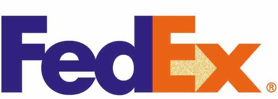
 Sometimes, a logo is just the initials or name of the company set in type. Think “Coca-Cola.” But even with this kind of logo, the type style and the way it is presented should communicate something about your company. Typestyles have a communication all their own. A script face can communicate refinement or opulence. A block face can communicate strength and stability. I rarely use a typeface “as-is” for a logo – I’ll tweak it, give it something special. Sometimes you can incorporate type and graphics in a clever way – how many people notice, for instance, the subliminal forward arrow in the Fed-Ex logo. But it’s there. Type should be used to create a unique and meaningful symbol of your company.
4. Appropriate and relevant: I see a lot of logos – particularly those produced by “logo farms,” that are just meaningless geometric shapes. Or generic “clip art.” These things don’t say anything special about your company. A symbol or graphic should make a unique statement about your company. Often you can incorporate a picture or symbol that is relevant to your business – a tool if you are a construction company, a house if you are in real estate. But again, it is important to avoid the trite and clichéd. Do something different with that imagery.
You should be able to look at a logo and instantly perceive what kind of company it is, and what the “personality” of that company is.
5. Useable and scalable: When all is said and done, you have to be able to actually use the logo in a variety of ways, from a tiny version on your business card, to a huge sign on the side of your building. The logo has to translate easily to any size and any use – printed on letterhead, stitched on company shirts, etched on metal plates or glass, cut from plastic and so on.
The basic logo has to “read” well at any size. That is why a logo is always prepared using a vector program like Adobe Illustrator, which allows the graphic to be scaled to any size without degradation or blurring. Vector files can be used for everything from printing to etching to screen printing.
I usually design a logo first in black and white. If it reads well in black and white, then it can be used anywhere and using different colors. The logo must be easily visible and recognizable on both a light and a dark background. It must be recognizable from a distance.
There is a lot that goes into an effective logo design. And it’s important not to skimp on it – after all, it’s the public face of your company.
(all logos above, except for FedEx were created by SkyHawk Studios. You can see more of our designs here). Also see our previous article about logo design, called “Why Professional Logo Design Does Not Cost $5.00, $25.00 or even $50.00”
-Jeff


Establishing a good logo for your company is necessary. It will somehow promote good reputation and a factor in identifying legitimacy.