Seven Tips for Creating Effective Web Color
Ever visited a website only to be so repulsed by the garish, horrible, clashing colors that you instantly exit the site?
There is nothing that screams “amateur” louder than the clumsy use of color on a website. We’ve all seen the worst examples – sites that assault your senses with six different neon hues – but even some web developers who should know better sometimes present color combinations that make us cringe – and make visitors leave rapidly.
There’s a lot to know about color theory, color harmony, and how to use color effectively, and any designer worth his or her salt has spent years perfecting this art – but even for the beginner, there are some easy ways to avoid the worst color gaffes.
1. Less is more
Just because you have hundreds of colors at your command doesn’t mean you should use them all. Remember, color is one of the tools you can use to create interest in your website content. Don’t make the color so overwhelming that your message gets lost. That neon yellow background may look “happy” to you, but you want people’s attention to go on your content, not on the background. Limit the number of colors you use, and if you use a strong color, use it to direct viewers to key content.
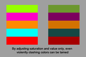
Two or more strong, bright colors placed next to each other can often clash horribly. When colors clash, it causes discomfort for the viewer, and they may well leave your site just because of that discomfort. Some neophytes to the use of color only think of color in terms of its full-strength hue. “Let’s make the background RED!” “Let’s make the lettering YELLOW!”
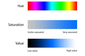
There are three dimensions to color: hue, saturation and value. Hue is which color (red, green, blue, etc.). Saturation is how much color (a blue-grey is a de-saturated blue). Value is light or dark (red, for instance, can vary from a light pink tint to a deep burgundy).
By playing with the saturation and value of colors, two clashing hues can be made to live together comfortably.
There has been a lot of research and study on the subject of color harmony – which colors look good with each other, and how to create effective color palates. A thorough study of the subject is essential for anyone who wants to become professional in the subject. There are many online references to start with, such as this summary.
There are a couple of ways to get your feet wet with color harmony. One is called monochromatic harmony, where one simply takes one color, say a blue, and varies the saturation and value to make several different versions of that color – see the Loewy Design website above.
Another is analogous harmony, where one uses colors that are next to each other on a color wheel – for instance all cool colors, such as greens and blues, or all warm colors, such as yellows and oranges. See the Ecoki site, above.
As you get more ambitious, you can try other combinations, such as complimentary or triadic – but remember to vary the saturation and value so the colors sit well together and don’t clash. Bold spots of a complimentary hue can often be used effectively to highlight key content or navigation.
ColorSchemeDesigner allows you to play around with different types of color harmony.
It helps to know who you are trying to appeal to. Young people, for instance, have a greater toleration of bright colors and bold color combinations. So you might expect a website catering to teenage girls to have a lot of bright pinks, vibrant reds or bold yellows – like the GossipTeen site above. On the other hand, a business site would tend to be more subtle in its color use, such as blues and greys, like IMB’s website, above.
A rock band might prefer a site that has a dark and grungy look, perhaps with bold reds. A holistic clinic, on the other hand, might prefer a clean, white, minimalist look, with tints of cool greens or blues.
A male-oriented sports site might use bold, bright colors, where a female oriented fashion site might use subtle tints.
Look at other sites that appeal to the same audience – what colors are they using?
Different colors have different meanings, as this SmashingMagazine article details.
This can be highly subjective, and varies from culture to culture, but you should be aware that the wrong color can send the wrong message, while the right color can support your message.
Red, for instance, is associated with fire, violence, love, passion. If you’re promoting a destination health spa, where people go for healing and relaxation, red would not be your best choice – you might go with calming blues and earth tones, such as those used on the Canyon Ranch website, above. But if you’re creating a website for a hot new night club, deep reds and golds might be the perfect choice, as on the website for Atlanta’s Opera night club, above.
Value and saturation can also change the meaning of a color. A light, vibrant blue can be hopeful and refreshing. A dark blue can connote sadness. A subtle blue-grey can give a feeling of stability and permanence.
Know what your message is and what kind of an emotion or feeling you are trying to communicate, then use the colors that will forward that message.
Color is an important part of your branding. The color (or colors) of your logo should be the key color of your website. A consistent color scheme that integrates with your branding will give customers confidence. They know they’ve come to the right place.
Contrast the H & R Block site, above, with the UPS site. H & R Block has a light green logo. Their site uses a bright green as its key color. You know, at a glance, that you’re on their site. UPS, on the other hand, has a well-known brown logo. It’s also the color of their highly visible trucks. But when you visit their website, it’s teal blue. The first impression you get is that you’re on the wrong site!
Inspiration for great color combinations can come from many sources – other websites, magazine advertising, billboards. Start noticing pleasing color combinations in the world around you, whether it’s a painting you like, a brightly colored house in your neighborhood, a beautiful sunset, an attractive outfit you see on the street. Make a mental note of the colors. See if you can spot the hue, saturation and value of each color, and how they work together.
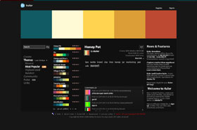
There are many online resources to inspire you and help you find and develop effective color combinations. One of my favorites is Adobe Kuler.
What are your experiences with color? Have you noticed any websites with particularly bad use of color? Any with excellent use of color?


