


How to Effectively Design your Website & other Promotional Items for your Specific Target Market
This is the third article in a series on targeted marketing. The first two were How to Find Your Target Market and How to Reach Your Target Market.
Marketing is never done to “everyone.” Any business, product or service has a specific target public that it is aiming for. It may be men or women, young people or seniors, business people or college students. The more exactly you can define your niche, the more successful you will be. And a key part of appealing to your target audience is design. How your website (or your literature, catalog or business card) looks determines whether or not your target public is attracted to it and will actually read it. If it doesn’t look like it is “for them,” they will leave your website or throw away your literature.
Let’s look at a few of the design factors that can affect your overall “look.”
Color:
You may have a favorite color or color combination, but will it appeal to your target public? Every color communicates something different. Blue tends to be calming and ethereal, red denotes excitement and action, green signifies nature and the environment. When you start dealing with the many color shades and tints, and combining colors in different ways, the communication possibilities are endless.
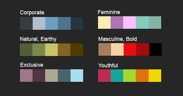
Have a look at some of the combinations above. You can see that each combination of colors communicates something entirely different. Conservative blues and greys in combination are very corporate-looking. Earth tones communicate naturalness. Rich, muted colors can be used to communicate exclusivity. Light, colorful pastels are feminine, while bold, warm colors are masculine. Bright, colorful hues in combination are used to market to children. Every target public calls for a slightly different color palette.
The Adobe Kuler website is very useful in finding and experimenting with different color combinations and the messages they communicate.
Type Styles:
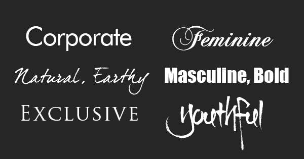
Like colors, every type style communicates something very different. Matching up the right type style with your target public is a key step in effectively communicating to that public. If you take a look at the examples above, you can see how the letter-forms themselves communicate very different things.
The most basic type choice is serif or sans-serif. Serifs are the little “feet” and the ends of letters. Serifs give greater definition to the letters and so serif fonts are considered more readable.
Use a serif font if you want to communicate the qualities of warmth, humanism, conservatism, traditionalism, intellectualism.
Sans-serif fonts don’t have those little “feet.” The letters are simpler and more geometric. Use sans-serif fonts to communicate these qualities: modern, technical, crisp, simple, youthful.
For print projects (flyers, brochures, catalogs, print ads, etc.), you choice of type fonts is unlimited. Great sources for free type fonts include dafont.com and fontzone.net.
For web use, you are limited to the fonts which are in common use by browsers. These include Andale Mono (formerly Monotype), Arial, Arial Black, Courier New, Georgia, Impact, Times New Roman, Trebuchet MS, Verdana, and Adobe Minion Web. However, a nice collection of free, open-source fonts optimized for the web can be found at Google Fonts.
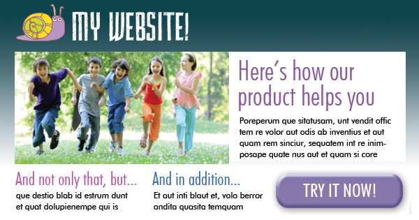
Photos and Illustrations:
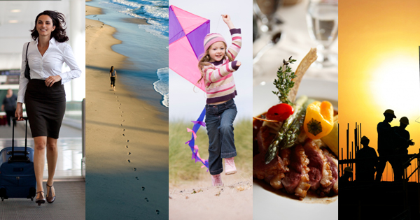
Selecting the right photographs and illustrations for your target public is key. The people shown in the photographs must seem to be them (or what they aspire to be). If you are appealing to seniors, then show good-looking seniors in the photographs. If your target audience is young couples, then show them in your pictures.
Like colors and typefaces, every picture communicates a message, over and above what the picture actually shows. In the examples above, the first photo shows a young business woman. But it also communicates drive, determination, and moving towards a goal. The second one shows a woman on a beach, but it also communicates introspection, peace, and solitude. The third one communicates happiness, freedom, and innocence. And so on.
Choose the pictures and illustrations that forward your unique message and image to your target group.
Excellent sources of stock imagery are istockphoto.com and dreamstime.com/.
Shapes:
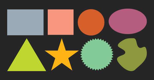
Different shapes also communicate different things. Squares and rectangles communicate stability, structure, rationality, trust, honesty, and conformity. Circles suggest wholeness, completeness, motion, unity and harmony. Ovals communicate femininity, grace, warmth, opulence and sensuality. A triangle can suggest stability, power, action, conflict and strength. A star can communicate exclusivity, excitement, honor, patriotism, energy or hope. A seal emblem communicates trust, quality, assurance. Irregular organic shapes can communicate nature, creativity, spontaneity, or casualness. I am sure you can think of many more shapes and what they might communicate.
Use the shapes which forward the message and image you are trying to establish with your target public.
Layout:
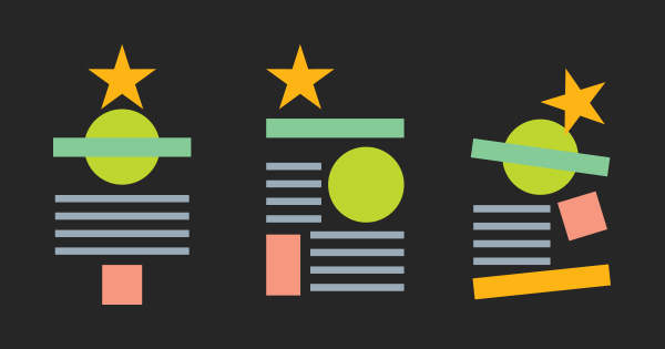
The way shapes and elements are placed on a page affects the communication. Centering the elements on a page, for instance, can communicate stability, conservatism, order, wealth, balance, or formality. A more random placement suggests casualness, informality, or creativity. Placing elements on a tilt can suggest fun, insouciance, energy, emphasis or rebellion.
When laying out your page for web or print, be sensitive to what the placement of shapes on the page is communicating.
Visual Hierarchy:
What are the most important things to your target audience? What are they most concerned about? What are the most common questions that they have? Make sure that these things are the most prominent ones on your website. Grab their attention right away with the items that are most likely to get their attention first. Then lead them through your website (or brochure) step by step using a well-defined “eye-trail.”
Good, relevant content is your most important tool in reaching your target group. Make sure you are talking to them, using the words and phrases that they use. Emphasize the benefits that you offer to them specifically. Show them how your product or service addresses their specific problems and challenges. Imagine your target consumer as a single individual, and talk to that person. Lead them through, step-by-step, to your call-to-action.
Follow these guidelines, and you’ll have promotional literature and websites that have impact, relevance, and appeal to your target market.
Are there any other ways that you have made your products more appealing to your target group?

Pingback: How much should a website cost? - SkyHawk Studios
If you have such videos uploaded on to your website,
then the popularity of your website increases too. She got a free trial from one of those ‘download to
watch’ movie sites and constantly asked me how to use it.
Laughter, by the way, is not the same thing as humor.
I really like your blog.. very nice colors & theme.
Did you design this website yourself or did you hire someone to do it for you?
Plz respond as I’m looking to create my own blog and would like to find out where u got this from.
thank you