12 Clever Type-Only Logos
Can Your Logo Be Type-Only or Does It Have to Be an Image?
Not all clients need a symbol or picture as their logo. Sometimes an effective logo can be made using typography only. After all, logos is Latin for “word,” and a logotype, back in the days of hot metal type, was a uniquely set or arranged typeface. Sometimes the name of a company (or its initials) lends itself to a unique type treatment. The Coca Cola and IBM logos are well known examples.
Here are some of my favorite type-only logos that cleverly use the company name to create a unique branding:
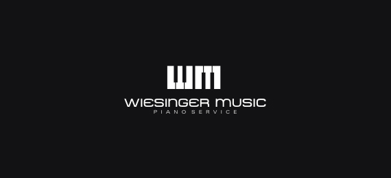
Weisinger Music cleverly uses a piano keyboard to create the initials of the company.
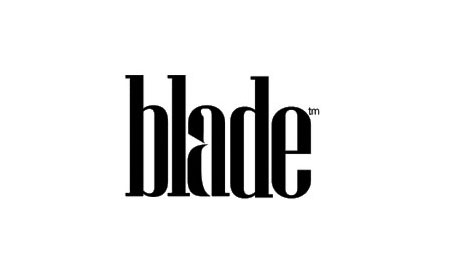
Blade uses the negative spaces of the lower case letter “a” to visually create a knife.
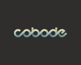
Cobode is a specialist architectural design firm promoting affordable housing for single people based on a unique “co-housing” model. The letter treatment forwards the idea of harmony and living together. 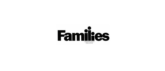
The “Families” logo uses the letters to visually show a family.
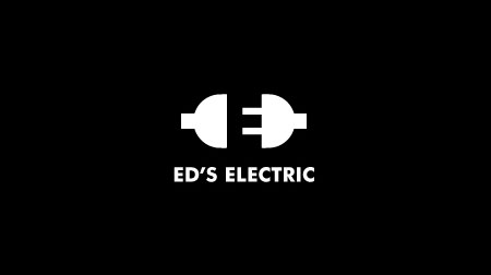
Ed’s Electric. I love this one. Male and female electrical plugs form the letter “E”. Can you see it? (hint: the “E” is formed from the black space between the electrical plugs) Reminiscent of the “hidden” arrow in the FedEx logo.
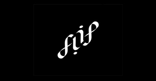
This concept logo for Flipside Entertainment can be read right-side-up or upside-down.
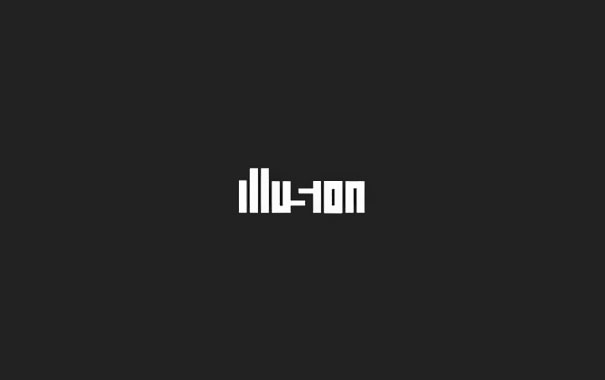
This “Illusion” logo forms the “s” with negative space.
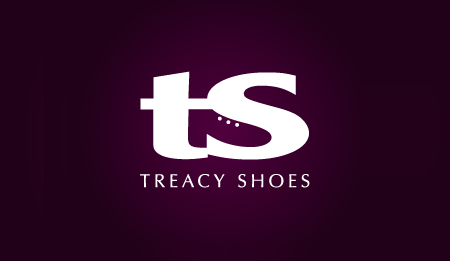
Treacy Shoes: a clever use of the negative space of the initials to form an image of their product.
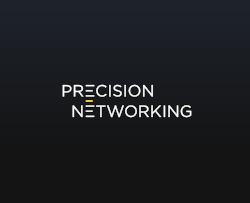
Precision Networking: The horizontal lines of the “E”s are connected by a yellow bar – a subliminal “network.”
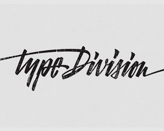
Type Division: This one is simply beautiful – elegant calligraphy.
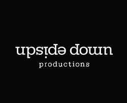
Upside Down: clever use of flipped letters while retaining readability.

Bio: here, the name of the company forms a plant.
Do you have a type-only logo you particularly like?