


What is Responsive Web Design and why you might need it.
 Once upon a time, life was simple. People accessed the web on their desktop computers or laptop computers. If you were designing a website, it just had to look good on a computer screen. Simple.
But over the last few years – chaos! People are now accessing the web from all sorts of devices – tablets, smartphones – literally thousands of different devices with all sorts of screen sizes. A May 2013 Pew study found that 56% of American adults now have a smartphone, and 34% own a tablet computer.
Mashable recently declared that 2013 is the year of Responsive Web Design. In their article, they noted that
For the first time since 2001, PC sales are projected to be lower than they were in the previous year. So which devices are consumers buying? Tablets, for one thing. Tablet sales are expected to exceed 100 million this year. Their sales numbers may top notebooks next year. Smartphones, of course, are also a hot commodity — according to Nielsen, the majority of U.S. mobile subscribers now own smartphones, not feature phones.
Does this smartphone make my website look bad?
Your website will look different depending on the device it’s viewed on. That brilliant design that looks great on a desktop computer could look terrible on a smaller screen. You may have had the experience of trying to visit a website on your tablet or smart phone and finding that part of the site is cut off. Or you have to scroll around to see the whole site. Or the site is so small on your smart phone that you have to pinch and zoom to read it. All of these things are not optimal web experiences.
One solution has been to design a special “mobile” website that would look good on a small screen. But this requires creating two websites – double work. And having the same content on two websites may negatively affect your search engine rankings (there is still some debate on this). Unless the content of the mobile site is going to be very different from the main website, having a separate duplicate website for mobile could be impractical and expensive.
The optimum solution is a single website design that responds to whatever device is accessing it and reformats itself to deliver a design that is clear and readable at that screen size. Hence, the development of Responsive Web Design (RWD).
What is Responsive Web Design?
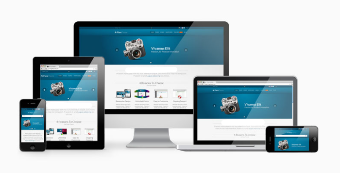
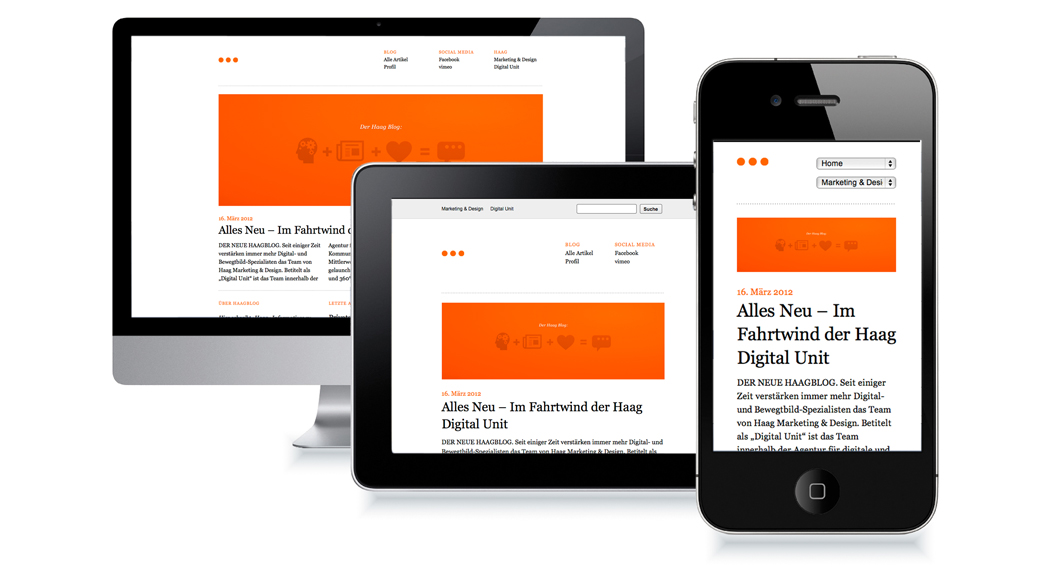 Without getting too technical, a Responsive Web Design reacts to the type of device it is being viewed on. The site uses media queries to determine the width of the screen it is being viewed on, then uses a fluid grid and flexible images to adjust the website layout so it looks good on the smaller screen. Photographs are sized to fit the screen, and the design may be changed to look right on the smaller device. For instance, a design that has three columns on a desktop computer may be reduced to one column on a smartphone.
To put it simply, RWD can detect the device you’re using (whether desktop computer, laptop, mobile device or tablet) and automatically adjust the site’s design elements to fit the screen size you’re using while maintaining the website’s look and feel.
Do I need a Responsive Website?
If you check your web traffic, you can determine how many visitors are accessing your site through mobile devices. (In your Google Analytics, select “Audience” on the left side, then “Mobile” to see how much traffic is coming from mobile devices.) If a significant percent of your visitors are using mobile devices to view your website, you should consider changing to a responsive design.
Certain types of businesses are more likely to get mobile visitors than others. A restaurant is likely to have people searching for them on a mobile device, for instance. Retail shops may have a large percentage of mobile visitors. News sites, popular blogs and online forums may have many visitors from tablets and smartphones. A 2012 mobile device study showed that people use mobile devices for entertainment, social interaction, shopping, planning future activities, and getting news and information.
In contrast, a business-to-business service website may get low mobile traffic. RWD is not a panacea for every type of business. But it’s always best to check where your customers are coming from.
Responsive design is the future of websites. With consumers accessing the web through more and more devices, we recommend that all of our clients look into the practicality and feasibility of a responsive website.
Any questions? We’re here to help you understand the constantly changing world of the web.

Pingback: How much should a website cost? - SkyHawk Studios
Pingback: Five Reasons to Get a New Website in 2016 - SkyHawk Studios