


Seven Simple Web Design Tips That Can Lower Your Bounce Rate
Why is the bounce rate on your website so high?
Are people bouncing off of your website home page? Do they leave your home page without clicking through to other content? If so, your website may be violating some simple, time-tested design basics.
This isn’t a new problem for graphic designers. Even in the far distant Dark Ages of magazine and newspaper advertising, designers had to figure out how to lead viewers through Attention-Interest-Desire-Action, the old AIDA formula. The most effective layouts are those that direct the viewer’s attention from start to finish. In graphic design parlance, we call this the “eye trail” – a series of visual clues that lead a viewer through an ad layout – or through a web page – to Action (the click-through).
Here are a few simple tips to improving your website’s “eye trail.”
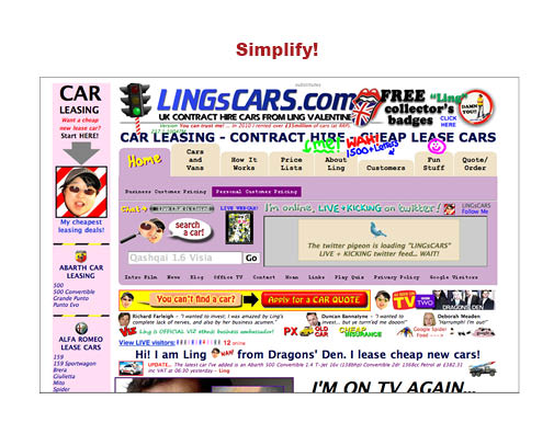 1. Keep it simple: Yes, I know, there’s a lot you want on your home page – your special offers, your photographs, your video, your Twitter feed. But if you try to do too much, your website ends up looking cluttered and cheap. Relax. Take a deep breath. Then try to boil down what you want to say and show. What are potential customers most likely to respond to? What makes your company unique? What’s your main customer benefit? Make that your main element and de-emphasize or omit everything else.
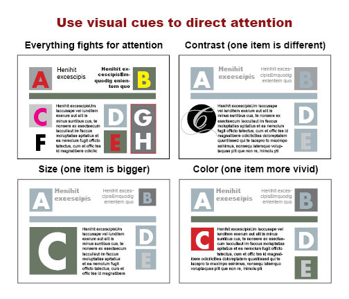 2. Direct Attention: There are many ways to visually focus attention. When someone lands on your site, don’t greet them with four or five competing elements, all clamoring for attention. Pick ONE thing and make it the main element. You can call attention to an element using contrast (make it different from the other elements), size (make it larger), color, even position (where it is on the page).
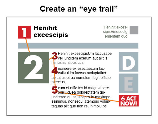 3. Direct the eye: Use visual cues to direct the viewer’s attention from start to finish. Make it obvious where you want the eye to travel. This is what we call the “eye trail.” Readers’ eyes, in this society at least, naturally travel from left to right, top to bottom. Guide them along the path you want them to travel.
4. Use headlines: The old-time adman knew that the effectiveness of his ad depended on a brilliant headline. Well, so does the effectiveness of your website. You have to attract the viewer, interest them, intrigue them, promise them a benefit. Give them a reason to explore what you have to say. And, for the sake of search engines, make sure your headlines are relevant and describe your actual content.
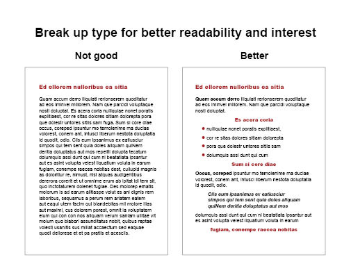 5. Break up your text: Long, solid blocks of text will put readers off. It looks daunting. As they say, TLDR (too long, didn’t read). Break text up with headlines, subheads, bullet points, indented paragraphs. Make the text look interesting and easy to read. Use these text devices to point up key information.
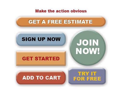 6. Make the action obvious: Don’t hide your “call to action.” Make it obvious what you want them to do. Use color, size and placement to draw the eye to your key action links.
7. Content, content, content: Reward your viewers with interesting things to look at, to read, to do, to download. Ultimately, viewers will stay on your site if they see something interesting there. And remember, interesting content isn’t about you or your company, it’s about them. It’s not “We take pride in our superior widgets,” it’s “Here’s how our widgets can improve your life.”
What other tips can you offer that have helped prevent visitors from bouncing off your website?


Pingback: How much should a website cost? - SkyHawk Studios