You Might Need a New Logo if…
Ok, so we like Jeff Foxworthy’s humor! But seriously…
Do you cringe a bit when you look at your logo? Are you a bit embarrassed to hand out your business card with that old logo on it? Do you envy the unique, professional logos of your competitors? Have you been thinking about upgrading your company image?
Redoing a logo is not a decision to be taken lightly. After all, you have some equity in your existing logo. Your customers are familiar with it. You’ve built up a reputation and an image. But your current logo just may be working against you.
Here are seven signs that you just might need a new logo:

“It was fine when we were a startup, but now…”: That logo was fine when you were operating out of your garage, or your home office. And you didn’t have the budget for a graphic designer or a real branding program, so you just cobbled something together. But now you’ve moved on – while your logo is stuck in the past. Maybe a new, professional logo would signal to your customers just how far you’ve come.
We tried to do it on the cheap: Sure, a logo farm, or a crowdsourced logo, or your nephew the art student looked like a good solution at the time, but now you’re starting to think that may not have been such a good move. It looks like every other logo out there. It doesn’t say anything about your company, your branding, your personality. It could be time for something that uniquely represents your company.

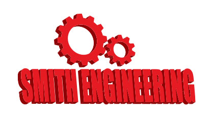
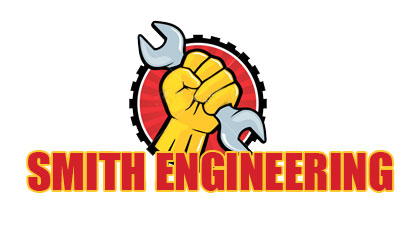
It contains clip art: Sure, it seemed like a good solution at the time – just find some clip art online. I’m a plumber, I’ll find a wrench graphic. I breed horses, I’ll find a horse graphic. But now it’s starting to look tired, hackneyed, plain vanilla. And your company is not plain vanilla. You know it – and maybe you need a logo that expresses that.

It’s really just our name set in type: It seemed like the easiest solution – just find a nice type face and set your company name with it. But no matter how great your company name looks set in Times Roman or Helvetica or Papyrus, it just does not have the impact you want. People’s eyes just pass over it; they don’t really see it; they don’t remember it. Maybe it’s time to do more than just type.

It’s clichéd: I’m sure that graphic swoop looked just great when you first used it. Then gradually you realized that everyone was using that same swoop. Or that image of Planet Earth. Or those dancing stick figures. If you’re longing for a logo that stands out from the pack, it might be time to call a logo designer.

It doesn’t work: It doesn’t fit right on your business card. It doesn’t look good on your website. It doesn’t fit as your Facebook profile image. When you try to reproduce it in black and white, it gets confused and mushy. All the detail gets lost when you try to reduce it to ¾” for your business card. Maybe it’s time for a logo designer who plans for all of your intended uses.
It doesn’t reflect who we are now: Times change. Your company changes. That logo that looked so trendy back in the 90s looks a little dated now. Your business, your products, your services, your clientele have all changed over time. Maybe your logo needs to change to keep up.
So, is it time for a new logo?