Does This Logo Make Me Look Cheap?
You want your logo to enhance your company’s image. You want it to look professional, contemporary, and represent the quality of your products and services. So how do you avoid a logo that makes your company look small, unprofessional, backward, or cheap?
 One could just hire a big agency and throw a lot of money at them. Unfortunately, that doesn’t always guarantee a good logo. Just ask the 2012 London Olympics. As Dolly Parton once said, “You’d be surprised how much it costs to look this cheap!”
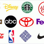
 On the other hand, inexpensive doesn’t always mean bad. After all, Nike’s famous “swoosh” logo was designed in 1971 by a student for just $35.
So what makes a logo look cheap?
 1. Too obvious: A logo does not have to literally depict what your company does or produces. Nike’s logo, you’ll notice, does not have a shoe in it. Yet how many logos for dental clinics show a tooth? How many logos for plumbers show a wrench? Check out the logos of other companies in your business category and you will soon see what the overused clichés are. Instead of literally showing what you sell, why not communicate the intangibles, the spirit of your company or its products? Nike doesn’t just sell shoes, they sell speed and agility – which is why the swoosh works. Logo mills and pre-designed stock logos tend to steer you towards the most obvious, literal solutions.
 2. Vague ideas: Cheap logos often don’t look like anything and don’t communicate anything – they are just a vague geometric shape or some generic lettering. A good logo says something about the company and what makes it unique. It differentiates the company and its products from competitors. A good logo uses images, shapes, colors, and forms that make a powerful statement.
 3. Stock images: Stock photography and illustration sites like iStockPhoto and Shutterstock have their uses, but just taking one of their vector images and using it as a logo isn’t one of them. The same goes for pre-designed stock logos. First, another company could use the exact same image. Second, there is nothing in a stock image that makes a unique statement about a company. It’s generic. A good logo isn’t pulled from a stock bin.
 4. Too complicated: A logo containing a lot of different type faces just screams “amateur.” A cheap logo often tries to incorporate too many visual ideas, or too complex a graphic. A good logo has to be recognizable even if it’s reproduced small – on a letterhead or business card, for instance. A great logo focuses on one clear concept. Good designers think about what they can subtract from a logo, not what they can add.
 5. Too many gimmicks: If a logo requires a lot of colors, drop shadows, metallic effects, bevels and shading to have impact, it’s a good bet that it’s a cheap logo. A good logo should “read” and have impact in its simplest black-and-white version.
6. Jarring colors: Cheap logos often use too many colors, or colors that are jarring or clashing. A good logo uses color tastefully – and in a way that forwards the image the company is trying to project.
 7. Unprofessional design work: Cheap logos often look awkward. They are off-balance, or poorly drawn. Why do companies accept them? Well, maybe it was designed by someone’s nephew. Or maybe the firm they hired didn’t offer them any options and they thought they had to accept it. One of these $19 logo farms had the gall to state that “the first design is always the best” and “revising it just makes it less professional.” Sure.
But with your company’s image on the line, it’s never a good idea to settle for a cheap logo. (our other articles on how to simplify your logo , what makes a logo “good” and why professional logos do not cost $5.00 or even $50.00 may be of interest to you)
What do you think makes a logo look cheap or unprofessional?