How to Design a Great Logo
Designing your logo is one of the most important promotional tasks for your company. Your logo is your public face. If it looks amateur, people will assume that your company is amateur and unprofessional. If your logo is well designed and has impact, people will assume your company is serious and professional.
Whether you are designing your logo in-house, or working with an outside graphic designer, here are some of the key factors to consider:
1. Work out your branding: I can’t overstress the importance of this. Trying to design a logo without having your branding worked out is like traveling without a map or a GPS. You are going it blind. In order to develop a meaningful and effective logo, you have to answer some important questions. What is the personality of your company? What do you stand for? What makes your company or your products unique? What is your positioning in the market? Once you’ve got these things firmly in mind, you can start to work out an effective logo. See my article “What is Branding, and Should I Worry About It.”
2. Avoid clichés and trends: The first pitfall in designing a company logo is to fall into using well-worn images and themes. Logo design goes through fads and trends, and there may be a temptation to go along with the current trend so that your logo looks hip and cutting-edge. But it may have the opposite effect – making you look like everyone else.
Remember the “swoosh” logos? After Nike had such success with their minimalist “swoosh,” everyone wanted one. And so you got a rash of meaningless swooshes. What did they do for company branding? Nothing. The logo disappeared into a sea of sameness.
Or how about the ubiquitous “V-Man logos?
There have been many, many other over-used images: trees or leaves to convey a “green” company, business graphs going up, certain fad shapes and type styles. There were the so-called “Web 2.0” logos with their 3D effects, color gradients. soft rounded typefaces and reflections. The most recent trend in logos was the so-called “hipster logo” or X logo trend.
It looks like a big X with four objects arranged around it. It’s supposed to add a rustic, yet modern tone to the brand. There’s even a tongue-in-cheek Hipster Logo Design Guide that tells you “no concept necessary.”
One of the best collections of cliché and overused logo ideas I’ve found is here.
The message is, before you design or approve a logo, get familiar with the over-used logo trends and avoid them.
It’s also a good idea to research the logos of your competitors, and other companies in the same business as you are. Be alert to over-used imagery within your own industry or type of business. You want your logo to stand out, not blend in.
3. Make it distinctive and memorable: Coming up with a unique, memorable idea can be daunting. It can seem like everything has been done before. This is where brainstorming comes in. The best way to approach this is to come up with a lot of ideas, a lot of sketches.
Where to get ideas? Well, the company branding should give you some direction..The company name, if it has been properly worked out (see my article How to Name Your Startup) may provide ideas. There may be a particular image, object, or animal that resonates with you. The type of business or the products or tools that you use may provide some inspiration.
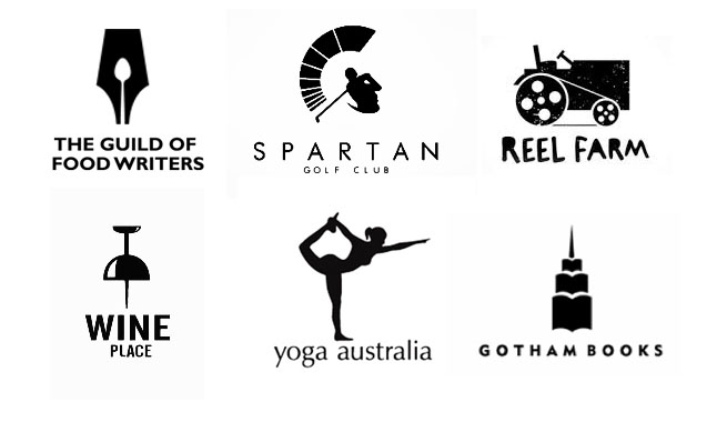
Even the most obvious symbols – a wrench for a plumber, a pen for a writer – may provide a starting point. But you’d have to put an interesting spin on the obvious, something that makes a unique or memorable statement about your company.
Beware of using meaningless shapes. That was all the rage several decades ago, but geometric shapes by themselves do little to establish company branding.
Some of my favorite logos combine objects or letters into a clever visual pun or a visual double-entendre. You can sometimes take two objects and combine them. Or combine objects with letters, such as the initials of your company.
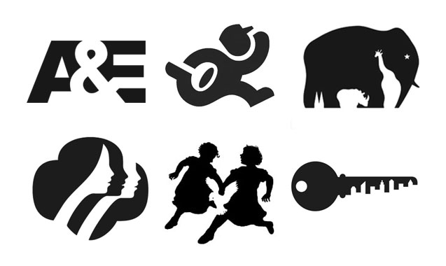
4. Use the negative space: Negative space is the white space that surrounds an object in a image. The shape of that negative space is just as important as the shape of the object. It defines boundaries and brings balance to a composition. Logo designers often use the white negative space to cleverly carve out recognizable shapes or letters.
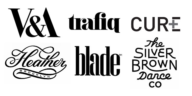
5. Consider an all-type logo: Sometime, the logo can simply be the name of the company or its initials set in type – think Coca-Cola, IBM, or YouTube. But just setting your company name in type isn’t really a logo. You have to do something different with the type to make it unique and memorable. Custom type, hand-drawn calligraphy, or specially modified type can all serve to make a logo that will attract attention and forward your branding.
6. Simplify, simplify, simplify: You want your logo to have instant, powerful impact. You don’t want it to be confusing or complex. It has to communicate in an instant, even when used small on a business card or letterhead. So work to make it as simple as possible.
Don’t use too many colors. Eliminate gradients, shadows, and reflections. Try to boil your design down to its essentials. Get rid of unnecessary graphic elements. A simple, bold, unique logo makes your company look big and professional. A complex. confused logo makes your company look small and amateur.
7. Make sure it’s useable and scalable: Practically speaking, you have to make sure your logo will reproduce well, whether it’s blown up huge on the side of your building, on the side of a truck, or a tiny version on your business card.. The logo has to translate easily to any size and any use – printed on letterhead, stitched on company shirts, etched on metal plates or glass, cut from plastic and so on.
That is why a logo is always prepared using a vector program like Adobe Illustrator, which allows the graphic to be scaled to any size without degradation or blurring. If you are not familiar with the difference between vector and bitmapped graphics, read my article Logo and Photo Quality.
Creating an effective logo takes work and inspiration. And it’s important not to skimp on it – after all, it’s the public face of your company. In the long run, it’s a good investment to do a professional job of logo design.


