What Can 5 Major Companies Teach You About Simplifying Your Logo?
One of the most important qualities of a good logo is simplicity. The best logos are simple, bold, and easily recognizable, whether on the side of a building or on a business card. An effective logo needs to be recognizable at a glance, clear and distinct.
Looking at the evolution of some famous logos over time, one can see this trend towards more and more simplicity – and we can learn something about how to simplify a logo to give it more clarity and impact.
Prudential has been using the Rock of Gibraltar as their logo since the 1870s. The original logo, as you can see here, was quite ornate, with a round frame, a banner, and a slogan “The Prudential has the strength of Gibraltar.” Well, this is a case of “see-say” – if you can see it, you don’t need to say it, so the phrase was eliminated over time. The ornate frame was replaced with a simple circle. Even as complex a shape as a mountain can be simplified to an easily recognized icon, and you see that happening over time – in fact, they took it too far in the 1984 version, where it is no longer recognizable, so they dialed it back a bit. Takeaway lesson: Does your logo have too many elements? See if you can simplify it to one commanding image. Any graphic image, no matter how complex, can be reduced to a simple, powerful icon.
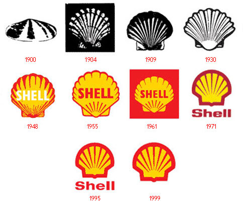
Looking at the early images used by Shell Oil, one can see that these were basically photographs of shells that had been reduced to high-contrast black and white images for ease of printing. They were little more than the “clip art” of the day. Over time, the shape of the shell is simplified further and further, reducing the shell shape to a simple graphic icon. The distinctive red and yellow is established in the 1940s and is used consistently to the present. Eventually even the word “Shell” is removed – another case of “see-say” – you can see the shell, so you don’t need to say it. Takeaway lesson: Don’t ignore brand equity when streamlining your logo. If you have established shapes and colors, keep them, just simplify, simplify, simplify. Build on your company image while making it stronger.
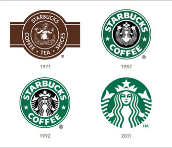
Way back in 1971, when Starbucks was a single store in Seattle, someone found a 16th century Norse woodcut of a twin-tailed mermaid, and decided to make it the shop’s logo. It was fun and quirky – a nod to Seattle’s seafaring history. But as the company grew, it needed simpler and more powerful branding. The old woodcut was transformed into a graphic icon, the border was simplified and eventually eliminated. Takeaway lesson: That quirky, handmade logo may have worked fine when you were a startup, but it screams “small company.” As you grow, you may want to refine it and streamline it for more powerful branding.
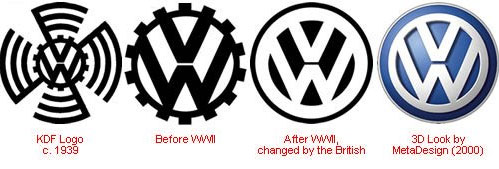
You can see that the original 1939 “VW” logo had a lot going on – the “VW” letters, surrounded by a gear, surrounded by spinning graphics to possibly suggest speed. The spinning graphics disappear first, then the gear. Again, this is an exercise in eliminating anything that is not essential and concentrating on one strong central image. Takeaway lesson: Does your logo have too much going on? Are there peripheral elements that could be eliminated to make it stronger, such as borders, banners, or frames? What is the single central graphic you should be concentrating on?
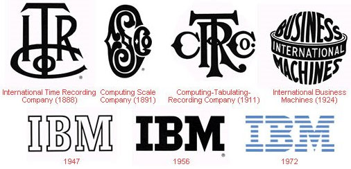 5. IBM – When your initials are your logo
You can do a lot with initials, from the ornate to the simple, as this timeline of logos shows. IBM went under many different names and initials in its long history, finally settling on a simple “IBM” logo in 1947. Yes, simple, almost too simple – it looks like an out-of-the-box typestyle. By 1956, they had refined the type to give it a distinctive company look, then added the familiar blue stripes. Takeaway lesson: Sure, you can use your initials as your logo, but do something distinct and unique with it, don’t just use a standard typeface. Have a designer work it over to give your company something special and instantly recognizable.
Your logo is your public face, so when you create it or review it, make it something unique and powerful. And take a lesson from these major companies – simplify, simplify, simplify.
What’s your take on the above?


